使用CSS3 制作一个material-design 风格登录界面实例
时间:2017-04-09同样是设置圆角
.container>.logo>.logo-block-bottom {
    position: absolute;
    height: 60px;
    width: 80px;
    box-sizing: border-box;
    background-color: #FFA000;
    z-index: 1001;
    top: 65px;
    left: 35px;
    border-radius: 7px;
}
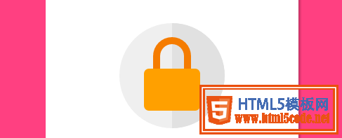
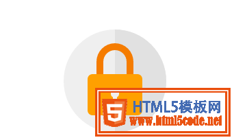
设置钥匙心,这个也分为两部分,上面的圆孔和和下面的椭圆
刚好可以设置在 lock-bottom 的 before和after伪元素上面
.container>.logo>.logo-block-bottom::before {
    content: " ";
    position: absolute;
    height: 12px;
    width: 12px;
    background-color: #EFEFEF;
    border-radius: 5px;
    top: 22px;
    left: 34px;
    box-sizing: border-box;
}
.container>.logo>.logo-block-bottom::after {
    content: " ";
    position: absolute;
    height: 12px;
    width: 6px;
    background-color: #EFEFEF;
    border-radius: 2px;
    top: 30px;
    left: 37px;
    box-sizing: border-box;
}
到这里 logo 就完成了
下面是 ' 用户登录 ' 标题.
注意,这里最好使用margin 而不是padding,不要破坏原有h4 标签.
.container>.login-header {
    text-align: center;
    font-size: 23px;
    color: #FF4081;
    font-weight: 400;
    margin: 15px 0 18px 0;
}
为内容添加一个容器
.container>.content {
    width: 90%;
    margin: 0 auto;
}
添加一个 form-group,包含 label和input 标签,设置相对布局
.container>.content>.form-group {
    position: relative;
}
下面就是核心部分,为input 设置样式(这里会产生一个bug,在结尾会介绍)
.container>.content>.form-group>.form-control {
    z-index: 3;
    position: relative;
    height: 58px;
    width: 100%;
    border: 0px;
    border-bottom: 1px solid #777;
    padding-top: 22px;
    color: #FF4081;
    font-size: 12px;
    background: none;
    box-sizing: border-box;
    outline: none;
    display: inline-block;
    -webkit-transition: 0.3s;
    transition: 0.3s;
}
labe 标签,使用绝对定位,将其放置到Input的上面.
.container>.content>.form-group>.form-label {
    z-index: 1;
    position: absolute;
    bottom: 10px;
    left: 0;
    font-size: 15px;
    -webkit-transition: 0.3s;
    transition: 0.3s;
}
为两个form group 设置一定的间距,否则下面会挡住上面设置的 box-shadow
.container>.content>.form-group>:first-child {
    margin-bottom: 5px;
}
添加动态效果
.container>.content>.form-group>.form-control:focus,
.container>.content>.form-group>.form-control:valid {
    box-shadow: 0 1px #FF4081;
    border-color: #FF4081;
}

.container>.content>.form-group>.form-control:focus+.form-label,
.container>.content>.form-group>.form-control:valid+.form-label {
    font-size: 12px;
    -ms-transform: translateY(-20px);
    -webkit-transform: translateY(-20px);
    transform: translateY(-25px);
}
下面就到了底部option ,也分为两部分,option-left 和 option-right
.container>.content>.option {
    width: 100%;
    height: 14px;
    margin-top: 24px;
    font-size: 16px;
}

.container>.content>.option>.option-left {
    width: 50%;
    float: left;
}

.container>.content>.option>.option-left>a,
.container>.content>.option>.option-left>a:hover {
    color: #FF4081;
    text-decoration: none;
}
在option-right 中,要注意 这个复选框并不是原生的Input,而是使用div 旋转而得,因为原生的checkbox无法更改样式.
.container>.content>.option>.option-right {
    width: 50%;
    float: right;
    text-align: right;
    position: relative;
}

.container>.content>.option>.option-right>.md-checkbox {
    height: 18px;
    width: 18px;
    display: inline-block;
    box-sizing: border-box;
    position: absolute;
    background-color: #FF4081;
    cursor: pointer;
    position: absolute;
    top: 3px;
    right: 68px;
}

.container>.content>.option>.option-right>.md-checkbox[checked]:after {
    content: " ";
    border-left: 2px solid #fff;
    border-bottom: 2px solid #fff;
    height: 8px;
    width: 15px;
    box-sizing: border-box;
    position: absolute;
    transform: rotate(-45deg);
    top: 3px;
    left: 2px;
}
这里使用css3 中的旋转,而模仿一个选中效果
注意: 虽然div无法直接选中,但还是可以为其添加一个checkd属性, 这个属性是一个特殊的css 事件效果,可以通过js来控制.
最后,登录按钮.
 MATERIAL DESIGN:构建软件的物质世界
 深聊MATERIAL DESIGN引领的设计趋势
 Design.Open.Raina—活动页设计经验分享
 最新UIDesigner 2.5设计分享
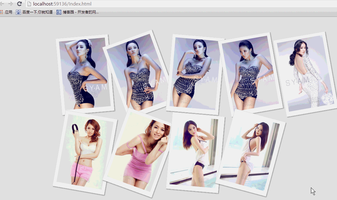 纯css实现照片墙3D效果的示例代码这篇文章主要介绍了纯css实现照片墙3D效果的示例代码,可以实现鼠标经过图片实现改变,具有一定的参考价值,感兴趣的小
 纯 Css 绘制扇形的方法示例本篇文章主要介绍了纯 Css 绘制扇形的方法示例,小编觉得挺不错的,现在分享给大家,也给大家做个参考。一起跟随小编过