使用CSS3 制作一个material-design 风格登录界面实例
时间:2017-04-09心血来潮,想学学 material design 的设计风格,就尝试完成了一个登录页面制作.
这是整体效果.
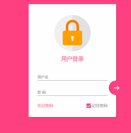
感觉还不错吧,结尾会附上代码
在编写的过程中,没有使用任何图片或者字体图标,全部使用css3完成,还是遇到一些难点和bug,所以想笔记下来,以后方便查阅.
响应式设计
在这个页面中,使用下面3点来完成响应式设计
1、最大宽度 .设定了一个 max-width 的最大宽度,以便在大屏幕时兼容.
2、margin : 20px auto; 使其保持时刻居中
3、组件使用像素
关于响应式的设计要点还有很多。
整体页面布局
<!DOCTYPE html>
<html lang="en">

<head>
    <meta charset="UTF-8">
    <title>Document</title>
    <meta http-equiv="X-UA-Compatible" content="IE=edge,chrome=1">
    <meta name="viewport" content="width=device-width, initial-scale=1.0">
    <link rel="stylesheet" href="styles/style.css">
</head>

<body>
    <div class="container">
        <div class="logo">
            <div class="logo-block-top">
            </div>
            <div class="logo-block-bottom">
            </div>
        </div>
        <h4 class="login-header">用户登录</h4>
        <div class="content">
            <div class="form-group">
                <input type="text" required class="form-control">
                <label class="form-label">用户名</label>
            </div>
            <div class="form-group">
                <input type="text" required class="form-control">
                <label class="form-label">密 码</label>
            </div>
            <div class="option">
                <div class="option-left"><a href="">忘记密码</a></div>
                <div class="option-right">
                    <span class="md-checkbox" checked="checked"></span>
                    <label class="form-label">记住密码</label>
                </div>
            </div>
        </div>
        <button class="login-button">
            <span class="icon-login"></span>
        </button>
    </div>
</body>
<script src="./app.js type=" text/javascript "></script>

</html>
CSS 开始
给 body 添加样式
html {
    font-family: "Microsoft YaHei", 宋体, "Segoe UI", "Lucida Grande", Helvetica, Arial, sans-serif, FreeSans, Arimo;
    background-color: #FF4081;
    color: #777;
}
版心
.container{
    position: relative;
    max-width: 360px;
    margin: 0 auto;
    margin-top: 30px;
    padding: 45px 20px;
    border-radius: 4px;
    box-shadow: 2px 2px 5px rgba(0, 0, 0, 0.3);
    background-color: #fff;
    box-sizing: border-box;
}
注意,这里调整内部边距使用了padding 而不是对子元素使用margin,因为如果要使用margin,为了BFC 的效果,就需要加上 overflow: hidden. 这样就会对尾部按钮溢出产生影响.
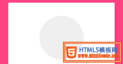
头部logo
.container>.logo {
    height: 150px;
    width: 150px;
    position: relative;
    background-color: #EFEFEF;
    border-radius: 75px;
    margin: 0 auto;
}
设置 border-radius 为 width和height的一般,就会使其成为一个圆
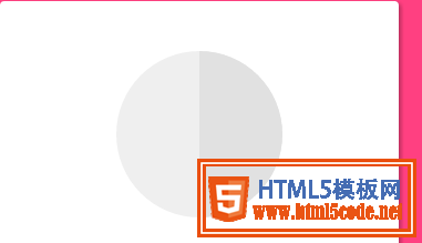
下面需要一个颜色更深的半圆
如何绘制一个半圆?
.container>.logo::after {
    content: ' ';
    height: 150px;
    width: 75px;
    position: absolute;
    background-color: #E1E1E1;
    border-radius: 0 75px 75px 0;
    left: 75px;
    top: 0;
}
设置宽度为高度的一般,然后设置左上角和左下角圆角为0,右边为75px
制作锁,分为两部分,lock-top 和 lock -bottom
.container>.logo>.logo-block-top {
    box-sizing: border-box;
    height: 45px;
    width: 54px;
    border: 10px solid #F57C00;
    border-bottom: 0;
    position: absolute;
    border-radius: 27px 27px 0 0;
    left: 48px;
    z-index: 1001;
    top: 20px;
}
 MATERIAL DESIGN:构建软件的物质世界
 深聊MATERIAL DESIGN引领的设计趋势
 Design.Open.Raina—活动页设计经验分享
 最新UIDesigner 2.5设计分享
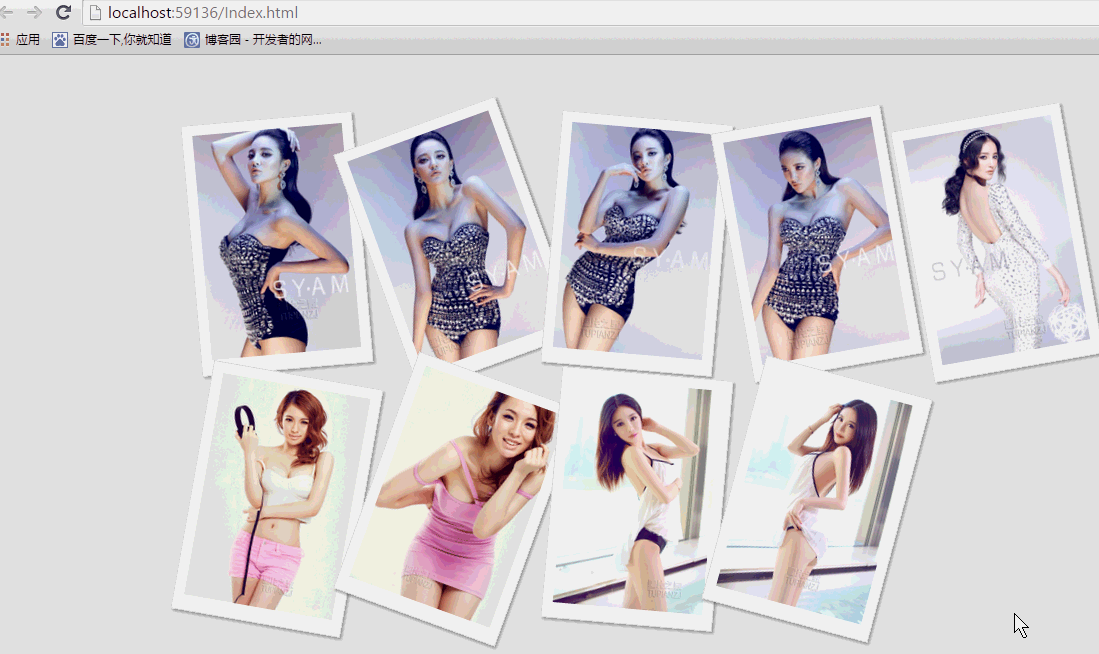 纯css实现照片墙3D效果的示例代码这篇文章主要介绍了纯css实现照片墙3D效果的示例代码,可以实现鼠标经过图片实现改变,具有一定的参考价值,感兴趣的小
 纯 Css 绘制扇形的方法示例本篇文章主要介绍了纯 Css 绘制扇形的方法示例,小编觉得挺不错的,现在分享给大家,也给大家做个参考。一起跟随小编过