CSS3,线性渐变(linear-gradient)的使用总结
时间:2017-04-084、Linear Gradient (with Even Stops):
/* Firefox 3.6+ */

background: -moz-linear-gradient(left, #ace, #f96, #ace, #f96, #ace);

/* Safari 4-5, Chrome 1-9 */

background: -webkit-gradient(linear, left top, right top, from(#ace), color-stop(0.25, #f96), color-stop(0.5, #ace), color-stop(0.75, #f96), to(#ace));

/* Safari 5.1+, Chrome 10+ */

background: -webkit-linear-gradient(left, #ace, #f96, #ace, #f96, #ace);

/* Opera 11.10+ */

background: -o-linear-gradient(left, #ace, #f96, #ace, #f96, #ace);
效果如下:

5、with Specified Arbitrary Stops:
/* Firefox 3.6+ */

 background: -moz-linear-gradient(left, #ace, #f96 5%, #ace, #f96 95%, #ace);

 /* Safari 4-5, Chrome 1-9 */

 background: -webkit-gradient(linear, left top, right top, from(#ace), color-stop(0.05, #f96), color-stop(0.5, #ace), color-stop(0.95, #f96), to(#ace));

 /* Safari 5.1+, Chrome 10+ */

 background: -webkit-linear-gradient(left, #ace, #f96 5%, #ace, #f96 95%, #ace);

 /* Opera 11.10+ */

 background: -o-linear-gradient(left, #ace, #f96 5%, #ace, #f96 95%, #ace);
效果如下:

6、角度(Angle):
正如上面看到的示例,如果您不指定一个角度,它会根据起始位置自动定义。如果你想更多的控制渐变的方向,您不妨设置角度试试。例如,下面的两个渐变具有相同的起点left center,但是加上一个30度的角度。
没有角度的示例代码:
background: -moz-linear-gradient(left, #ace, #f96);

background: -webkit-linear-gradient(left,#ace,#f96);

background: -o-linear-gradient(left, #ace, #f96);
加上30度的角度代码:
background: -moz-linear-gradient(left 30deg, #ace, #f96);

background: -webkit-gradient(linear, 0 0, 100% 100%, from(#ace),to(#f96));

background: -o-linear-gradient(30deg, #ace, #f96);
效果图如下:


当指定的角度,请记住,它是一个由水平线与渐变线产生的的角度,逆时针方向。因此,使用0deg将产生一个左到右横向梯度,而90度将创建一个从底部到顶部的垂直渐变。我来看看你核心代码:
background: -moz-linear-gradient(<angle>, #ace, #f96);

background: -webkit-gradient(<type>,<angle>, from(#ace), to(#f96));

background: -webkit-linear-gradient(<angle>, #ace, #f96);

background: -o-linear-gradient(<angle>, #ace, #f96);
我们来看看各角度的区别:
.deg0 {

  background: -moz-linear-gradient(0deg, #ace, #f96);

  background: -webkit-gradient(linear,0 50%,100% 50%,from(#ace),to(#f96));

  background: -webkit-linear-gradient(0deg, #ace, #f96);

  background: -o-linear-gradient(0deg, #ace, #f96);

}


.deg45 {

  background: -moz-linear-gradient(45deg, #ace, #f96);

  background: -webkit-gradient(linear,0 100%,100% 0%,from(#ace),to(#f96));

  background: -webkit-linear-gradient(45deg, #ace, #f96);

  background: -o-linear-gradient(45deg, #ace, #f96);

}

.deg90 {

  background: -moz-linear-gradient(90deg, #ace, #f96);

  background: -webkit-gradient(linear,50% 100%,50% 0%,from(#ace),to(#f96));

  background: -webkit-linear-gradient(90deg, #ace, #f96);

  background: -o-linear-gradient(90deg, #ace, #f96);

}

.deg135 {

  background: -moz-linear-gradient(135deg, #ace, #f96);

  background: -webkit-gradient(linear,100% 100%,0 0,from(#ace),to(#f96));

  background: -webkit-linear-gradient(135deg, #ace, #f96);

  background: -o-linear-gradient(135deg, #ace, #f96);

}

.deg180 {

  background: -moz-linear-gradient(180deg, #ace, #f96);

  background: -webkit-gradient(linear,100% 50%,0 50%,from(#ace),to(#f96));

  background: -webkit-linear-gradient(180deg, #ace, #f96);

  background: -o-linear-gradient(180deg, #ace, #f96);

}

.deg225 {

  background: -moz-linear-gradient(225deg, #ace, #f96);

  background: -webkit-gradient(linear,100% 0%,0 100%,from(#ace),to(#f96));

  background: -webkit-linear-gradient(225deg, #ace, #f96);

  background: -o-linear-gradient(225deg, #ace, #f96);

}

.deg270 {

  background: -moz-linear-gradient(270deg, #ace, #f96);

  background: -webkit-gradient(linear,50% 0%,50% 100%,from(#ace),to(#f96));

  background: -webkit-linear-gradient(270deg, #ace, #f96);

  background: -o-linear-gradient(270deg, #ace, #f96);

}

.deg315 {

  background: -moz-linear-gradient(315deg, #ace, #f96);

  background: -webkit-gradient(linear,0% 0%,100% 100%,from(#ace),to(#f96));

  background: -webkit-linear-gradient(315deg, #ace, #f96);

  background: -o-linear-gradient(315deg, #ace, #f96);

}

.deg360 {

  background: -moz-linear-gradient(360deg, #ace, #f96);

  background: -webkit-gradient(linear,0 50%,100% 50%,from(#ace),to(#f96));

  background: -webkit-linear-gradient(360deg, #ace, #f96);

  background: -o-linear-gradient(360deg, #ace, #f96);

}
效果如下:

相关文章
 详解CSS3 rem(设置字体大小) 教程本篇文章主要介绍了详解CSS3 rem(设置字体大小) 教程,小编觉得挺不错的,现在分享给大家,也给大家做个参考。一起
 CSS3 linear-gradient线性渐变生成加号和减号的方法本篇文章主要介绍了CSS3 linear-gradient线性渐变生成加号和减号的方法,具有一定的参考价值,感兴趣的小伙伴们可以参
 CSS mask-image属性详细介绍(小结)这篇文章主要介绍了CSS mask-image属性详细介绍(小结)的相关资料,小编觉得挺不错的,现在分享给大家,也给大家做个
 浅谈css3中的渐进增强和优雅降级这篇文章主要介绍了css3中的渐进增强和优雅降级的相关资料,小编觉得挺不错的,现在分享给大家,也给大家做个参考
 浅谈css3新单位vw、vh、vmin、vmax的使用详解这篇文章主要介绍了浅谈css3新单位vw、vh、vmin、vmax的使用详解的相关资料,小编觉得挺不错的,现在分享给大家,也
- 浅谈css3中calc在less编译时被计算的解决办法这篇文章主要介绍了浅谈css3中calc在less编译时被计算的解决办法的相关资料,小编觉得挺不错的,现在分享给大家,
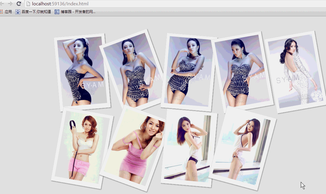 纯css实现照片墙3D效果的示例代码这篇文章主要介绍了纯css实现照片墙3D效果的示例代码,可以实现鼠标经过图片实现改变,具有一定的参考价值,感兴趣的小
 纯 Css 绘制扇形的方法示例本篇文章主要介绍了纯 Css 绘制扇形的方法示例,小编觉得挺不错的,现在分享给大家,也给大家做个参考。一起跟随小编过