div+css样式自制带小三角的tooltips效果
时间:2017-10-20代码和效果图如下:
<!DOCTYPE html>
<html>
<head>
<meta charset="utf-8" />
<title></title>
<style type="text/css">
.tooltips {
position: relative;
width: 300px;
height: 80px;
line-height: 60px;
background: #D7E7FC;
border-radius: 4px;
}
.arrow {
position: absolute;
color: #D7E7FC;
width: 0px;
height: 0px;
line-height: 0px;
border-width: 20px 15px 0;
border-style: solid dashed dashed dashed;
border-left-color: transparent;
border-right-color: transparent;
bottom: -20px;
right: 50%;
}
.tooltips {
position: relative;
width: 300px;
height: 80px;
line-height: 60px;
background: #D7E7FC;
border: 1px solid #A5C4EC;
border-radius: 4px;
}
.arrow {
position: absolute;
width: 0px;
height: 0px;
line-height: 0px;
border-width: 20px 15px 0;
border-style: solid dashed dashed dashed;
border-left-color: transparent;
border-right-color: transparent;
}
.arrow-border {
color: #A5C4EC;
bottom: -20px;
right: 50%;
}
.arrow-bg {
color: #D7E7FC;
bottom: -19px;
right: 50%;
}
</style>
</head>
<body>
<!--先定义一个相对定位的盒子div:-->
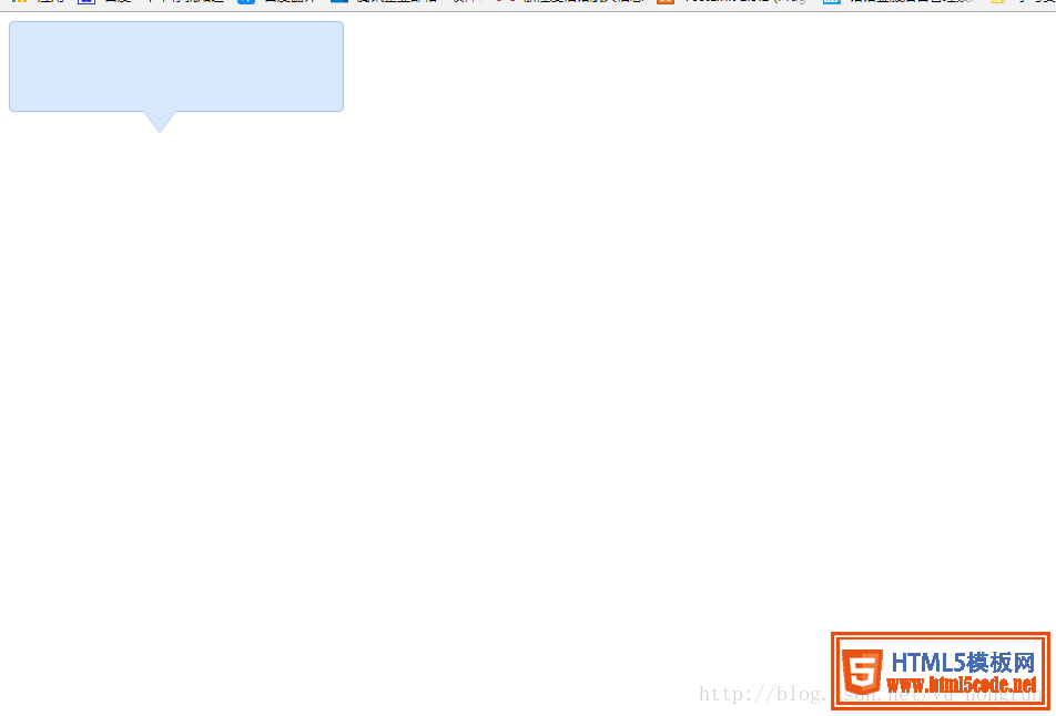
<div class="tooltips">
<!--给div盒子添加一个三角型图标-->
<div class="arrow "></div>
<!--给“小三角穿上松紧带”需要使用两个三角形叠加的方式-->
<!--首先我们定义两个三角形的div,一个背景色和盒子的边框颜色相同,一个背景色和盒子的背景色一致:-->
<div class="arrow arrow-border"></div>
<div class="arrow arrow-bg"></div>
<!--注意:.arrow-bg和.arrow-border的bottom位置相差为1px(可根据边框宽度调整)两个div的顺序不可颠倒。-->
</div>
</body>
</html>
效果展示图
总结
以上所述是小编给大家介绍的 div+css样式自制带小三角的tooltips效果,希望对大家有所帮助,如果大家有任何疑问请给我留言,小编会及时回复大家的。在此也非常感谢大家对网站的支持!
相关文章
 用CSS样式生成搜索、购物车等图标样式(图标字体库)这篇文章主要介绍了用CSS样式生成搜索、购物车等图标样式(图标字体库)的相关资料,需要的朋友可以参考下
- HTML中div和span比较_动力节点Java学院整理这篇文章主要介绍了HTML中div和span比较,分别介绍了div和span的用法和比较,有兴趣的可以了解一下
- CSS样式继承和层叠这篇文章主要介绍了CSS样式继承和层叠的相关资料,需要的朋友可以参考下
 HTML (css样式规范)必看篇下面小编就为大家带来一篇HTML (css样式规范)必看篇。小编觉得挺不错的,现在就分享给大家,也给大家做个参考。一
 HTML基础必看——全面了解css样式表下面小编就为大家带来一篇HTML基础必看——全面了解css样式表。小编觉得挺不错的,现在就分享给大家,也给大家做
 HTML基础知识——css样式表,样式属性,格式与布局详解下面小编就为大家带来一篇HTML基础知识——css样式表,样式属性,格式与布局详解。小编觉得挺不错的,现在就分享给
 纯css实现照片墙3D效果的示例代码这篇文章主要介绍了纯css实现照片墙3D效果的示例代码,可以实现鼠标经过图片实现改变,具有一定的参考价值,感兴趣的小
 纯 Css 绘制扇形的方法示例本篇文章主要介绍了纯 Css 绘制扇形的方法示例,小编觉得挺不错的,现在分享给大家,也给大家做个参考。一起跟随小编过