css3实现wifi信号逐渐增强效果实例
时间:2017-08-16整理文档,搜刮出一个css3实现wifi信号逐渐增强效果实例的代码,稍微整理精简一下做下分享。
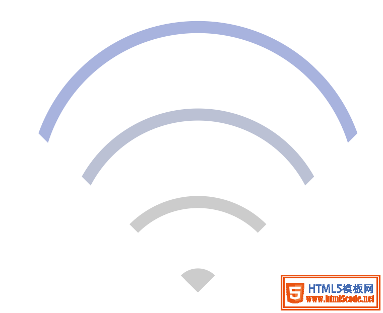
效果图
下面是实现代码:
<!DOCTYPE html>
<meta charset="utf-8">
<html>
<head>
    <title>wifi信号</title>
    <style type="text/css">
        *{
            margin: 0;
            padding: 0;
        }
        .box {
            width: 240px;
            height: 240px;
            box-sizing: border-box;
            position: relative;
            margin: 100px auto;
        }
        .wifi-symbol {
            width: 200px;
            height: 200px;
            margin-left: 18px;
            box-sizing: border-box;
            overflow: hidden;
            transform: rotate(45deg);

        }
        .wifi-circle {
            border: 10px solid #ccc;
            border-radius: 50%;
            position: absolute;
        }
        .first {
            width: 260px;
            height: 260px;
            top: 0;
            left: 0;
            animation: run1 4s linear infinite;
        }
        @keyframes run1 {
            0% {
                border-color: #ccc;
            }
            25% {
                border-color: #ccc;
            }
            50% {
                border-color: #ccc;
            }
            75% {
                border-color: #ccc;
            }
            100% {
                border-color: #97a8e6;
            }
        }
        .second {
            width: 200px;
            height: 200px;
            top: 60px;
            left: 60px;
            animation: run2 4s linear infinite;
        }
        @keyframes run2 {
            0% {
                border-color: #ccc;
            }
            25% {
                border-color: #ccc;
            }
            50% {
                border-color: #ccc;
            }
            75% {
                border-color: #97a8e6;
            }
            100% {
                border-color: #ccc;
            }
        }
        .third {
            width: 140px;
            height: 140px;
            top: 120px;
            left: 120px;
            animation: run3 4s linear infinite;
        }
        @keyframes run3 {
            0% {
                border-color: #ccc;
            }
            25% {
                border-color: #ccc;
            }
            50% {
                border-color: #97a8e6;
            }
            75% {
                border-color: #ccc;
            }
            100% {
                border-color: #ccc;
            }
        }
        .fourth {
            width: 20px;
            height: 20px;
            background: #ccc;
            top: 180px;
            left: 180px;
            animation: run4 4s linear infinite;
        }
        @keyframes run4 {
            0% {
                background: #ccc;
                border-color: #ccc;
            }
            25% {
                background: #97a8e6;
                border-color: #97a8e6;
            }
            50% {
                background: #ccc;
                border-color: #ccc;
            }
            75% {
                background: #ccc;
                border-color: #ccc;
            }
            100% {
                background: #ccc;
                border-color: #ccc;
            }
        }
    </style>
</head>
<body>
    <div class="box">
        <div class="wifi-symbol">
          <div class="wifi-circle first"></div>
          <div class="wifi-circle second"></div>
          <div class="wifi-circle third"></div>
          <div class="wifi-circle fourth">
        </div>
    </div>

</body>
</html>
以上就是本文的全部内容,希望对大家的学习有所帮助,也希望大家多多支持。
相关文章
 详解CSS3 rem(设置字体大小) 教程本篇文章主要介绍了详解CSS3 rem(设置字体大小) 教程,小编觉得挺不错的,现在分享给大家,也给大家做个参考。一起
 CSS3 linear-gradient线性渐变生成加号和减号的方法本篇文章主要介绍了CSS3 linear-gradient线性渐变生成加号和减号的方法,具有一定的参考价值,感兴趣的小伙伴们可以参
 CSS mask-image属性详细介绍(小结)这篇文章主要介绍了CSS mask-image属性详细介绍(小结)的相关资料,小编觉得挺不错的,现在分享给大家,也给大家做个
 浅谈css3中的渐进增强和优雅降级这篇文章主要介绍了css3中的渐进增强和优雅降级的相关资料,小编觉得挺不错的,现在分享给大家,也给大家做个参考
 浅谈css3新单位vw、vh、vmin、vmax的使用详解这篇文章主要介绍了浅谈css3新单位vw、vh、vmin、vmax的使用详解的相关资料,小编觉得挺不错的,现在分享给大家,也
- 浅谈css3中calc在less编译时被计算的解决办法这篇文章主要介绍了浅谈css3中calc在less编译时被计算的解决办法的相关资料,小编觉得挺不错的,现在分享给大家,
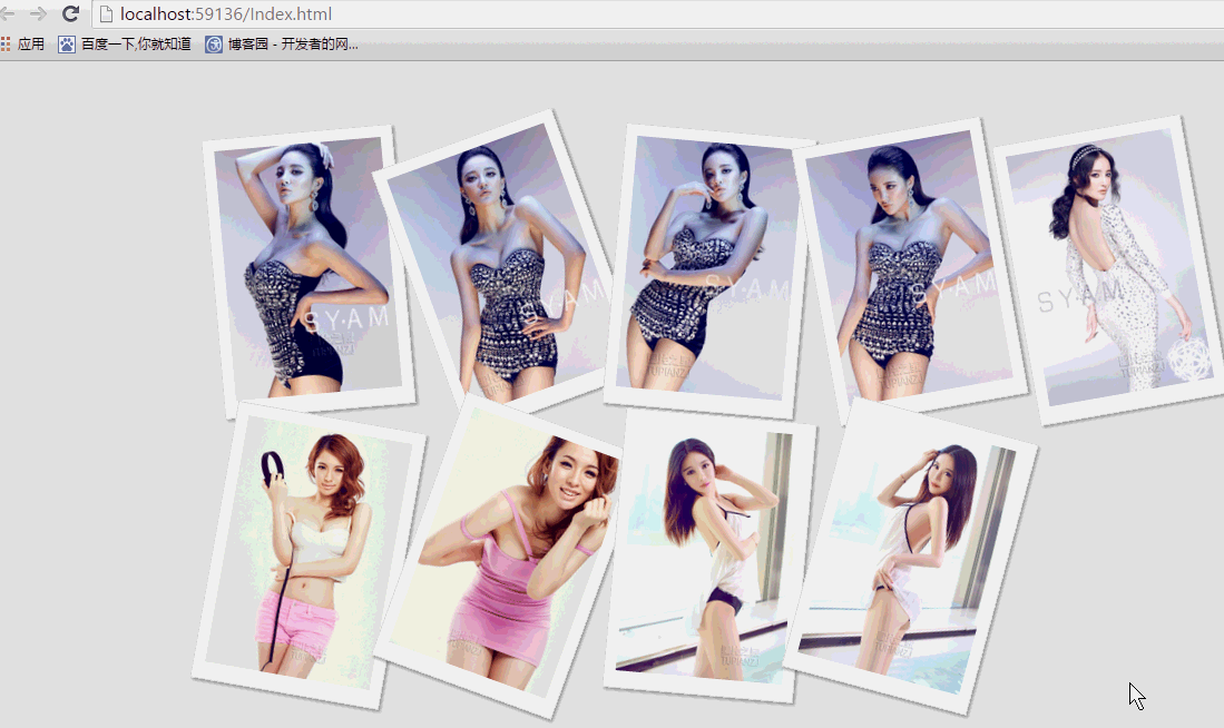 纯css实现照片墙3D效果的示例代码这篇文章主要介绍了纯css实现照片墙3D效果的示例代码,可以实现鼠标经过图片实现改变,具有一定的参考价值,感兴趣的小
 纯 Css 绘制扇形的方法示例本篇文章主要介绍了纯 Css 绘制扇形的方法示例,小编觉得挺不错的,现在分享给大家,也给大家做个参考。一起跟随小编过