CSS实现Tab布局的简单实例(必看)
时间:2017-05-08
ul,li{
  margin:0;
  padding:0;
  list-style:none;
}
.container{
  width:400px;
  height:300px;
  background-color:silver;
}
.tab-content{
  width:100%;
  height:80%;
  overflow:hidden;
}
.tab-content .item{
  width:100%;
  height:100%;
}
.tab-control{
  width:100%;
  height:20%;
}
.tab-control ul{
  height:100%;
}
.tab-control li{
  width:25%;
  height:100%;
  float:left;
  border:1px solid silver;
  box-sizing:border-box;
  background-color:white;
  cursor: pointer;
}
.tab-control li:hover{
  background-color:#7b7474
}
.tab-control a{
  display:inline-block;
  width:100%;
  height:100%;
  line-height:100%;
  text-align:center;
  text-decoration: none;
}
.tab-control a::after{
  content:"";
  display:inline-block;
  height:100%;
  vertical-align:middle;
}
上述方法只是利用了锚点切换,没有使用:target。修改CSS
ul,li{
  margin:0;
  padding:0;
  list-style:none;
}
.container{
  width:400px;
  height:300px;
  background-color:silver;
}
.tab-content{
  position:relative;
  width:100%;
  height:80%;
  overflow:hidden;
}
.tab-content .item{
  position:absolute;
  left:0;
  top:0;
  width:100%;
  height:100%;
}
.tab-control{
  width:100%;
  height:20%;
}
.tab-control ul{
  height:100%;
}
.tab-control li{
  width:25%;
  height:100%;
  float:left;
  border:1px solid silver;
  box-sizing:border-box;
  background-color:white;
  cursor: pointer;
}
.tab-control li:hover{
  background-color:#7b7474
}
.tab-control a{
  display:inline-block;
  width:100%;
  height:100%;
  line-height:100%;
  text-align:center;
  text-decoration: none;
}
.tab-control a::after{
  content:"";
  display:inline-block;
  height:100%;
  vertical-align:middle;
}

.tab-content .item:target{
  z-index:1;
  background-color:yellow;
}
item使用绝对定位,然后使用:target修改元素z-index达到切换效果(其实也可以通过控制元素的display来达到切换效果)
(2)针对布局二:
<div class="container">
   <ul>
     <li class="item active" id="item1">
       <p class="title"><a href="#item1">1</a></p>
       <p class="content">1</p>
     </li>
     <li class="item" id="item2">
       <p class="title"><a href="#item2">2</a></p>
       <p class="content ml1">2</p>
     </li>
     <li class="item" id="item3">
       <p class="title"><a href="#item3">3</a></p>
       <p class="content ml2">3</p>
     </li>
     <li class="item" id="item4">
       <p class="title"><a href="#item4">4</a></p>
       <p class="content ml3">4</p>
     </li>
   </ul>
</div>
ul,
li,
p {
  margin: 0;
  padding: 0;
  list-style: none;
}

.container {
  width: 400px;
  height: 300px;
  background-color: silver;
  border: 1px solid silver;
}

.container ul {
  width: 100%;
  height: 100%;
  overflow: hidden;
}

.container .item {
  float: left;
  width: 25%;
  height: 100%;
  background-color: white;
}

.container .item .title {
  line-height: 40px;
  border: 1px solid silver;
  box-sizing: border-box;
  text-align: center;
  cursor: pointer;
}
.container .item a {
  display:inline-block;
  width:100%;
  height:100%;
  text-decoration: none;
}

.container .item .content {
  width: 400%;
  height: 100%;
  background-color: yellow;
}

.ml1 {
  margin-left: -100%;
}

.ml2 {
  margin-left: -200%;
}

.ml3 {
  margin-left: -300%;
}

.active {
  position: relative;
  z-index: 1
}

.container .item:target {
  position: relative;
  z-index: 1
}

.container .item:target .title {
  border-bottom: none;
  background-color: yellow;
}
2、hover实现
(1)针对布局一:
无法简单的通过CSS实现
(2)针对布局二:
相关文章
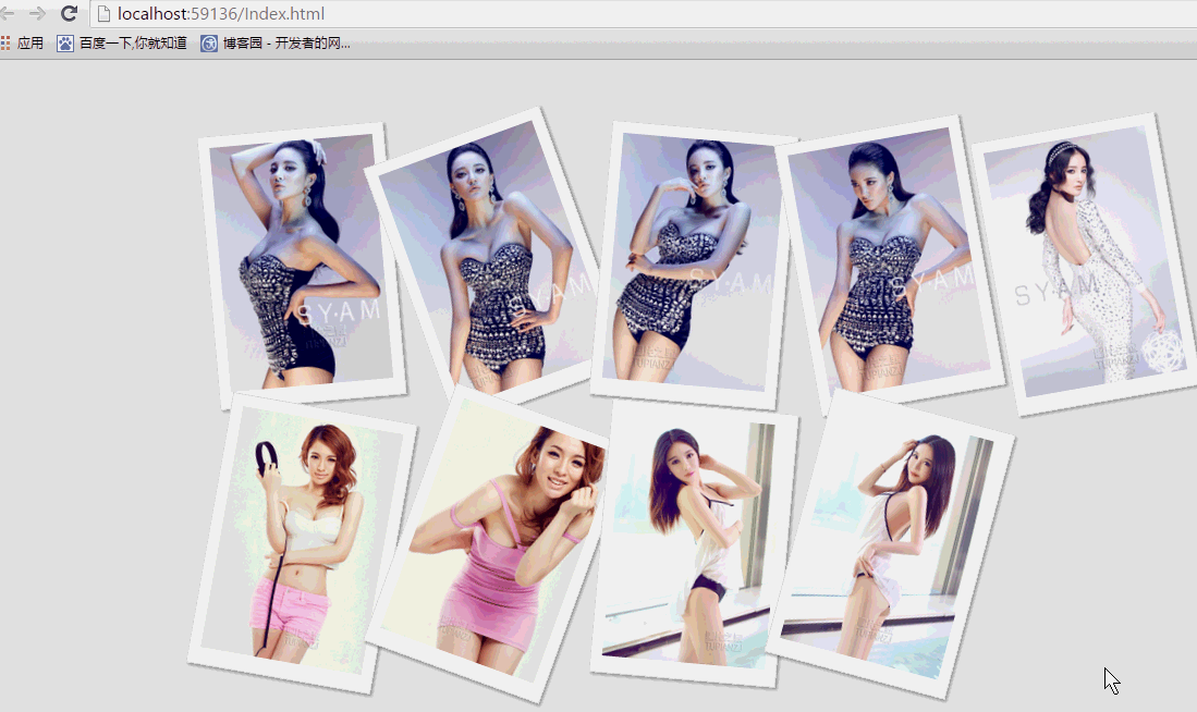 纯css实现照片墙3D效果的示例代码这篇文章主要介绍了纯css实现照片墙3D效果的示例代码,可以实现鼠标经过图片实现改变,具有一定的参考价值,感兴
 纯 Css 绘制扇形的方法示例本篇文章主要介绍了纯 Css 绘制扇形的方法示例,小编觉得挺不错的,现在分享给大家,也给大家做个参考。一起跟随
 一份纯CSS loading动画效果代码示例本篇文章主要介绍了一份纯CSS loading效果代码示例,小编觉得挺不错的,现在分享给大家,也给大家做个参考。一起跟
 css 实现文字过长自动隐藏功能这篇文章主要介绍了css 实现文字过长自动隐藏功能,需要的朋友可以参考下
 详解CSS3 rem(设置字体大小) 教程本篇文章主要介绍了详解CSS3 rem(设置字体大小) 教程,小编觉得挺不错的,现在分享给大家,也给大家做个参考。一起
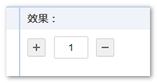 CSS3 linear-gradient线性渐变生成加号和减号的方法本篇文章主要介绍了CSS3 linear-gradient线性渐变生成加号和减号的方法,具有一定的参考价值,感兴趣的小伙伴们可以参