用CSS属性transparent实现各种三角形示例代码
时间:2017-04-09效果图如下
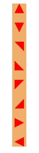
示例代码
<!DOCTYPE html>
<html>
<head lang="en">
    <meta charset="UTF-8">
    <title></title>
    <style>
        *{
            margin: 0;
            padding: 0;
        }
        .box{
            margin: 40px auto;
            width: 60px;
            background-color: #f0ac6b;
        }
        .t1{
            margin: 40px auto;
            width: 0px;
            height: 0px;
            /*background-color: #f0ac6b;*/
            border-bottom: 40px solid red;
            border-right: 20px solid transparent;
            border-left: 20px solid transparent;
        }
        .t2{
            margin: 40px auto;
            width: 0px;
            height: 0px;
            /*background-color: #f0ac6b;*/
            border-bottom: 40px solid transparent;
            border-right: 40px solid red;
            /*border-left: 20px solid transparent;*/
        }
        .t3{
            margin: 40px auto;
            width: 0;
            height: 0;
            border-top: 40px solid red;
            border-right: 20px solid transparent;
            border-left: 20px solid transparent;
        }
        .t4{
            margin: 40px auto;
            width: 0;
            height: 0;
            border-top: 40px solid transparent;
            border-left: 40px solid red;
        }
        .t5{
            margin: 40px auto;
            width: 0;
            height: 0;
            border-top: 40px solid red;
            border-right: 40px solid transparent;
        }
        .t6{
            margin: 40px auto;
            width: 0px;
            height: 0px;
            border-left: 40px solid transparent;
            border-bottom: 40px solid red;
        }
        .t7{
            margin: 40px auto;
            width: 0;
            height: 0;
            border-left: 40px solid red;
            border-bottom: 20px solid transparent;
            border-top: 20px solid transparent;
        }
        .t8{
            margin: 40px auto;
            width: 0;
            height: 0;
            border-right: 40px solid red;
            border-bottom: 20px solid transparent;
            border-top: 20px solid transparent;
        }
    </style>
</head>
<body>
<div class="box">
    <div class="t1"></div>
    <div class="t3"></div>
    <div class="t2"></div>
    <div class="t4"></div>
    <div class="t5"></div>
    <div class="t6"></div>
    <div class="t7"></div>
    <div class="t8"></div>
</div>

</body>
</html>
总结
以上就是这篇文章的全部内容了,希望本文的内容对大家的学习或者工作能带来一定的帮助,如果有疑问大家可以留言交流。
相关文章
 纯css实现照片墙3D效果的示例代码这篇文章主要介绍了纯css实现照片墙3D效果的示例代码,可以实现鼠标经过图片实现改变,具有一定的参考价值,感兴
 纯 Css 绘制扇形的方法示例本篇文章主要介绍了纯 Css 绘制扇形的方法示例,小编觉得挺不错的,现在分享给大家,也给大家做个参考。一起跟随
 一份纯CSS loading动画效果代码示例本篇文章主要介绍了一份纯CSS loading效果代码示例,小编觉得挺不错的,现在分享给大家,也给大家做个参考。一起跟
 css 实现文字过长自动隐藏功能这篇文章主要介绍了css 实现文字过长自动隐藏功能,需要的朋友可以参考下
 详解CSS3 rem(设置字体大小) 教程本篇文章主要介绍了详解CSS3 rem(设置字体大小) 教程,小编觉得挺不错的,现在分享给大家,也给大家做个参考。一起
 CSS3 linear-gradient线性渐变生成加号和减号的方法本篇文章主要介绍了CSS3 linear-gradient线性渐变生成加号和减号的方法,具有一定的参考价值,感兴趣的小伙伴们可以参