前端编码规范(4)—— CSS 和 Sass (SCSS) 开发规范
时间:2017-04-08css 代码:
@import url('//cdn.com/foundation.css');

html {
  font-family: 'open sans', arial, sans-serif;
}

body:after {
  content: 'pause';
}
推荐
css 代码:
@import url(//cdn.com/foundation.css);

html {
  font-family: "open sans", arial, sans-serif;
}

body:after {
  content: "pause";
}
选择器嵌套 (SCSS)
在Sass中你可以嵌套选择器,这可以使代码变得更清洁和可读。嵌套所有的选择器,但尽量避免嵌套没有任何内容的选择器。
如果你需要指定一些子元素的样式属性,而父元素将不什么样式属性,
可以使用常规的CSS选择器链。
这将防止您的脚本看起来过于复杂。
不推荐
css 代码:
// Not a good example by not making use of nesting at all
.content {
  display: block;
}

.content > .news-article > .title {
  font-size: 1.2em;
}
不推荐
css 代码:
// Using nesting is better but not in all cases
// Avoid nesting when there is no attributes and use selector chains instead
.content {
  display: block;

  > .news-article {
    > .title {
      font-size: 1.2em;
    }
  }
}
推荐
css 代码:
// This example takes the best approach while nesting but use selector chains where possible
.content {
  display: block;

  > .news-article > .title {
    font-size: 1.2em;
  }
}
嵌套中引入 空行 (SCSS)
嵌套选择器和CSS属性之间空一行。
不推荐
css 代码:
.content {
  display: block;
  > .news-article {
    background-color: #eee;
    > .title {
      font-size: 1.2em;
    }
    > .article-footnote {
      font-size: 0.8em;
    }
  }
}
推荐
css 代码:
.content {
  display: block;

  > .news-article {
    background-color: #eee;

    > .title {
      font-size: 1.2em;
    }

    > .article-footnote {
      font-size: 0.8em;
    }
  }
}
上下文媒体查询(SCSS)
在Sass中,当你嵌套你的选择器时也可以使用上下文媒体查询。
在Sass中,你可以在任何给定的嵌套层次中使用媒体查询。
由此生成的CSS将被转换,这样的媒体查询将包裹选择器的形式呈现。
这技术非常方便,
有助于保持媒体查询属于的上下文。
第一种方法这可以让你先写你的手机样式,然后在任何你需要的地方
用上下文媒体查询以提供桌面样式。
不推荐
css 代码:
// This mobile first example looks like plain CSS where the whole structure of SCSS is repeated
// on the bottom in a media query. This is error prone and makes maintenance harder as it's not so easy to relate
// the content in the media query to the content in the upper part (mobile style)

.content-page {
  font-size: 1.2rem;

  > .main {
    background-color: whitesmoke;

    > .latest-news {
      padding: 1rem;

      > .news-article {
        padding: 1rem;

        > .title {
          font-size: 2rem;
        }
      }
    }

    > .content {
      margin-top: 2rem;
      padding: 1rem;
    }
  }

  > .page-footer {
    margin-top: 2rem;
    font-size: 1rem;
  }
}

@media screen and (min-width: 641px) {
  .content-page {
    font-size: 1rem;

    > .main > .latest-news > .news-article > .title {
      font-size: 3rem;
    }

    > .page-footer {
      font-size: 0.8rem;
    }
  }
}
推荐
css 代码:
// This is the same example as above but here we use contextual media queries in order to put the different styles
// for different media into the right context.

.content-page {
  font-size: 1.2rem;

  @media screen and (min-width: 641px) {
    font-size: 1rem;
  }

  > .main {
    background-color: whitesmoke;

    > .latest-news {
      padding: 1rem;

      > .news-article {
        padding: 1rem;

        > .title {
          font-size: 2rem;

          @media screen and (min-width: 641px) {
            font-size: 3rem;
          }
        }
      }
    }

    > .content {
      margin-top: 2rem;
      padding: 1rem;
    }
  }

  > .page-footer {
    margin-top: 2rem;
    font-size: 1rem;

    @media screen and (min-width: 641px) {
      font-size: 0.8rem;
    }
  }
}
嵌套顺序和父级选择器(SCSS)
当使用Sass的嵌套功能的时候,
重要的是有一个明确的嵌套顺序,
以下内容是一个SCSS块应具有的顺序。
相关文章
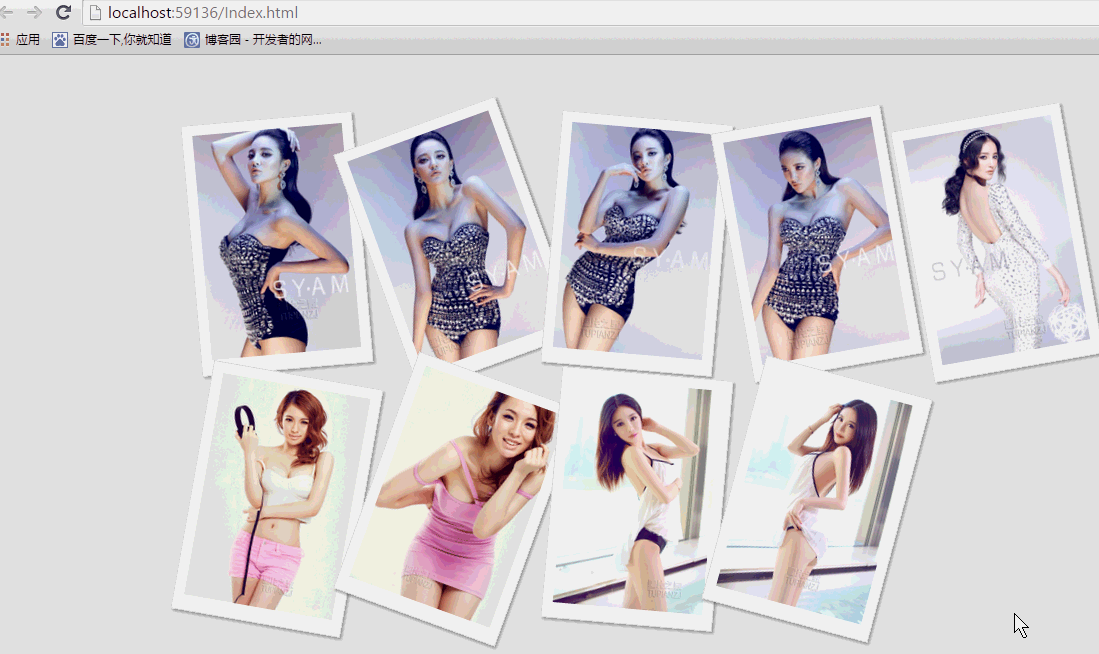 纯css实现照片墙3D效果的示例代码这篇文章主要介绍了纯css实现照片墙3D效果的示例代码,可以实现鼠标经过图片实现改变,具有一定的参考价值,感兴
 纯 Css 绘制扇形的方法示例本篇文章主要介绍了纯 Css 绘制扇形的方法示例,小编觉得挺不错的,现在分享给大家,也给大家做个参考。一起跟随
 一份纯CSS loading动画效果代码示例本篇文章主要介绍了一份纯CSS loading效果代码示例,小编觉得挺不错的,现在分享给大家,也给大家做个参考。一起跟
 css 实现文字过长自动隐藏功能这篇文章主要介绍了css 实现文字过长自动隐藏功能,需要的朋友可以参考下
 详解CSS3 rem(设置字体大小) 教程本篇文章主要介绍了详解CSS3 rem(设置字体大小) 教程,小编觉得挺不错的,现在分享给大家,也给大家做个参考。一起
 CSS3 linear-gradient线性渐变生成加号和减号的方法本篇文章主要介绍了CSS3 linear-gradient线性渐变生成加号和减号的方法,具有一定的参考价值,感兴趣的小伙伴们可以参