Bootstrap 字形图标(Glyphicons)
时间:2014-11-30本章将讲解字形图标(Glyphicons),并通过一些实例了解它的使用。Bootstrap 捆绑了 200 多种字体格式的字形。首先让我们先来理解一下什么是字形图标(Glyphicons)。
什么是字形图标(Glyphicons)?
字形图标(Glyphicons)是在 Web 项目中使用的图标字体。虽然,Glyphicons Halflings 需要商业许可,但是您可以通过基于项目的 Bootstrap 来免费使用这些图标。
为了表示对图标作者的感谢,希望您在使用时加上 GLYPHICONS 网站的链接。
获取字形图标(Glyphicons)
我们已经在 环境安装 章节下载了 Bootstrap 3.x 版本,并理解了它的目录结构。在 fonts 文件夹内可以找到字形图标(Glyphicons),它包含了下列这些文件:
- glyphicons-halflings-regular.eot
- glyphicons-halflings-regular.svg
- glyphicons-halflings-regular.ttf
- glyphicons-halflings-regular.woff
相关的 CSS 规则写在 dist 文件夹内的 css 文件夹内的 bootstrap.css 和 bootstrap-min.css 文件上。
字形图标(Glyphicons)列表
点击这里,查看可用的字形图标(Glyphicons)列表。
CSS 规则解释
下面的 CSS 规则构成 glyphicon class。
@font-face {
  font-family: 'Glyphicons Halflings';
  src: url('../fonts/glyphicons-halflings-regular.eot');
  src: url('../fonts/glyphicons-halflings-regular.eot?#iefix') format('embedded-opentype'), url('../fonts/glyphicons-halflings-regular.woff') format('woff'), url('../fonts/glyphicons-halflings-regular.ttf') format('truetype'), url('../fonts/glyphicons-halflings-regular.svg#glyphicons_halflingsregular') format('svg');
}

.glyphicon {
  position: relative;
  top: 1px;
  display: inline-block;
  font-family: 'Glyphicons Halflings';
  -webkit-font-smoothing: antialiased;
  font-style: normal;
  font-weight: normal;
  line-height: 1;
  -moz-osx-font-smoothing: grayscale;
}
所以 font-face 规则实际上是在找到 glyphicons 地方声明 font-family 和位置。
.glyphicon class 声明一个从顶部偏移 1px 的相对位置,呈现为 inline-block,声明字体,规定 font-style 和 font-weight 为 normal,设置行高为 1。除此之外,使用 -webkit-font-smoothing: antialiased 和 -moz-osx-font-smoothing: grayscale; 获得跨浏览器的一致性。
然后,这里的
.glyphicon:empty {
  width: 1em;
}
是空的 glyphicon。
这里有 200 个 class,每个 class 针对一个图标。这些 class 的常见格式如下:
.glyphicon-keyword:before {
  content: "hexvalue";
}
比如,使用的 user 图标,它的 class 如下:
.glyphicon-user:before {
  content: "\e008";
}
用法
如需使用图标,只需要简单地使用下面的代码即可。请在图标和文本之间保留适当的空间。
<span class="glyphicon glyphicon-search"></span>
下面的实例演示了如何使用字形图标(Glyphicons):
<!DOCTYPE html>
<html>
<head>
   <title>Bootstrap 实例 - 如何使用字形图标(Glyphicons)</title>
   <link href="/bootstrap/css/bootstrap.min.css" rel="stylesheet">
   <script src="/scripts/jquery.min.js"></script>
   <script src="/bootstrap/js/bootstrap.min.js"></script>
</head>
<body>

<p>
   <button type="button" class="btn btn-default">
      <span class="glyphicon glyphicon-sort-by-attributes"></span>
   </button>
   <button type="button" class="btn btn-default">
      <span class="glyphicon glyphicon-sort-by-attributes-alt"></span>
   </button>
   <button type="button" class="btn btn-default">
      <span class="glyphicon glyphicon-sort-by-order"></span>
   </button>
   <button type="button" class="btn btn-default">
      <span class="glyphicon glyphicon-sort-by-order-alt"></span>
   </button>
</p>
<button type="button" class="btn btn-default btn-lg">
  <span class="glyphicon glyphicon-user"></span> User
</button>
<button type="button" class="btn btn-default btn-sm">
  <span class="glyphicon glyphicon-user"></span> User
</button>
<button type="button" class="btn btn-default btn-xs">
  <span class="glyphicon glyphicon-user"></span> User
</button>


</body>
</html>
结果如下所示:

带有导航栏的字形图标(Glyphicons)
<!DOCTYPE html>
<html>
  <head>
    <title>导航栏的字形图标</title>
    <meta name="viewport" content="width=device-width, initial-scale=1.0">
    <!-- Bootstrap -->
    <link href="http://apps.bdimg.com/libs/bootstrap/3.2.0/css/bootstrap.min.css" rel="stylesheet">
    <style>
    body {
    padding-top: 50px;
    padding-left: 50px;
    }
    </style>
    <!--[if lt IE 9]>
      <script src="http://apps.bdimg.com/libs/html5shiv/3.7/html5shiv.min.js"></script>
    <![endif]-->
  </head>
  <body>
    <div class="navbar navbar-fixed-top navbar-inverse" role="navigation">
      <div class="container">
        <div class="navbar-header">
          <button type="button" class="navbar-toggle" data-toggle="collapse" data-target=".navbar-collapse">
            <span class="sr-only">Toggle navigation</span>
            <span class="icon-bar"></span>
            <span class="icon-bar"></span>
            <span class="icon-bar"></span>
          </button>
          <a class="navbar-brand" href="#">Project name</a>
        </div>
        <div class="collapse navbar-collapse">
          <ul class="nav navbar-nav">
            <li class="active"><a href="#"><span class="glyphicon glyphicon-home">Home</span></a></li>
            <li><a href="#shop"><span class="glyphicon glyphicon-shopping-cart">Shop</span></a></li>
            <li><a href="#support"><span class="glyphicon glyphicon-headphones">Support</span></a></li>
          </ul>
        </div><!-- /.nav-collapse -->
      </div><!-- /.container -->
    </div>
    <!-- jQuery (Bootstrap 插件需要引入) -->
    <script src="http://apps.bdimg.com/libs/jquery/2.1.1/jquery.min.js"></script>
    <!-- 包含了所有编译插件 -->
    <script src="http://apps.bdimg.com/libs/bootstrap/3.2.0/js/bootstrap.min.js"></script>
  </body>
</html>
定制字形图标(Glyphicons)
我们已经看到如何使用字形图标(Glyphicons),接下来我们看看如何定制字形图标(Glyphicons)。
我们将以上面的实例开始,并通过改变字体尺寸、颜色和应用文本阴影来进行定制图标。
下面是开始的代码:
<button type="button" class="btn btn-primary btn-lg">
  <span class="glyphicon glyphicon-user"></span> User
</button>
效果如下所示:
定制字体尺寸
通过增加或减少图标的字体尺寸,您可以让图标看起来更大或更小。
<button type="button" class="btn btn-primary btn-lg" style="font-size: 60px">
  <span class="glyphicon glyphicon-user"></span> User
</button>
定制字体颜色
<button type="button" class="btn btn-primary btn-lg" style="color: rgb(212, 106, 64);">
  <span class="glyphicon glyphicon-user"></span> User
</button>
应用文本阴影
<button type="button" class="btn btn-primary btn-lg" style="text-shadow: black 5px 3px 3px;">
  <span class="glyphicon glyphicon-user"></span> User
</button>
在线定制字形图标(Glyphicons)
点击这里,在线定制字形图标(Glyphicons)。
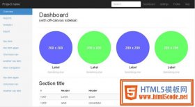 10款免费Bootstrap后台模板演示及下载自从有了类似Bootstrap这样强大的前端框架之后,无论我们是做静态页面,还是做网站主题,着实方便很多。即便有很
 高品质的Bootstrap3.0主题模板(专题着陆页/个人主页/单页网站/作品集网页)未来的网页设计趋势,我想响应式设计是热门,设计的时候都需要考虑其它设备浏览,比如手机、iPad平板电脑等手持
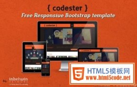 推荐7套不错的Bootstrap模板免费的响应式Bootstrap模板 - Codester 在线演示 Codester是一个基本的个人作品集Bootstrap模板,帮助设计师,摄影师,图形
 HTML5 前端框架 Bootstrap 使用教程1. 简介 Bootstrap 是 Twitter 推出的一个开源的前端框架。 Bootstrap 由 Twitter 的设计师 Mark Otto 和 Jacob Thornton 合作开发,由